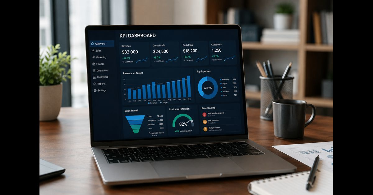
KPI dashboard best practices for small business begin with a simple rule: every prominent number must support a recurring decision. A useful dashboard shows whether performance is on track, why an important result may be changing, who owns the response, and when action is required.
It should not become a collection of every figure available in accounting, customer relationship management, ecommerce, advertising, and project software. More data can create less clarity when definitions conflict or nobody knows what a change requires.
A small business usually needs a focused primary view supported by deeper diagnostic pages. The dashboard is the visible layer; business intelligence is the broader discipline that turns reliable operational records into informed decisions.
Begin With Decisions, Not Available Data
Software naturally encourages users to display whatever is easiest to connect. That approach often produces attractive charts that have little managerial value.
Begin by listing the decisions the business makes daily, weekly, and monthly:
- Should spending be reduced or reallocated?
- Does the sales pipeline require more leads or better conversion?
- Are overdue invoices creating a cash constraint?
- Is demand exceeding delivery capacity?
- Is a product, service, customer segment, or channel becoming less profitable?
- Are customer complaints indicating an isolated incident or a persistent failure?
- Does inventory need to be reordered, discounted, or reduced?
A metric belongs on the primary dashboard when a meaningful change would affect one of these decisions. A figure that provides context but rarely changes an action can remain in a supporting report.
Give Every KPI a Complete Definition
A KPI name alone is not a definition. “Revenue,” “active customer,” “qualified lead,” and “on-time delivery” can each produce multiple legitimate values depending on the formula, source, and time window.
Every KPI should have a documented specification:
|
Field |
What must be recorded |
|
Name |
A plain-language label understood across the business |
|
Purpose |
The decision or objective the measure supports |
|
Formula |
Exact calculation, inclusions, exclusions, and rounding |
|
Data source |
Authoritative system, report, table, or responsible record |
|
Time window |
Daily, weekly, monthly, trailing period, or year to date |
|
Update timing |
When data becomes complete enough to use |
|
Owner |
Person accountable for explaining performance and coordinating action |
|
Target |
Desired result for the applicable period |
|
Intervention threshold |
Point at which investigation or action begins |
|
Breakdown |
Product, channel, location, customer segment, or team when relevant |
|
Known limitation |
Delay, estimation, missing coverage, or other constraint |
This record prevents two departments from presenting different answers to the same question. It also makes changes auditable. If the business alters a formula, it should note the effective date and determine whether historical results need to be recalculated.
Keep the Primary View Deliberately Small
A primary small-business dashboard can often begin with five to nine KPIs. The correct number depends on the business model, management responsibilities, and consequences of missing an important signal.
The main screen should represent the company’s critical economic and operational relationships rather than giving every department equal space. A service company may emphasize qualified pipeline, capacity, delivery time, gross margin, cash, and retention. A retailer may need sales, gross margin, inventory availability, conversion, average order value, returns, and cash.
Additional measures can sit in diagnostic views. This preserves access to detail without allowing secondary information to overwhelm the first review.
Choose a Balanced Set of Business Measures
Revenue alone cannot show whether growth is profitable, collectible, repeatable, or operationally sustainable. A balanced dashboard normally combines financial outcomes with the drivers that influence them.
|
Business area |
Possible KPI |
Basic calculation or interpretation |
Decision supported |
|
Revenue |
Revenue growth |
(Current revenue − comparable prior revenue) ÷ prior revenue × 100 |
Whether growth is accelerating or weakening |
|
Profitability |
Gross margin percentage |
(Revenue − cost of goods or services sold) ÷ revenue × 100 |
Pricing, product mix, supplier, and delivery decisions |
|
Cash |
Operating cash flow |
Cash generated or used by normal business operations |
Whether operations are producing usable cash |
|
Collections |
Days sales outstanding |
Average accounts receivable ÷ credit sales × days in period |
Collection effort and payment-term decisions |
|
Sales |
Qualified lead conversion |
New customers won ÷ qualified leads × 100 |
Whether pipeline quality or sales execution needs attention |
|
Marketing |
Customer acquisition cost |
Applicable acquisition spending ÷ new customers acquired |
Channel economics and budget allocation |
|
Customers |
Customer retention rate |
(Ending customers − new customers) ÷ starting customers × 100 |
Service, renewal, and customer-success priorities |
|
Operations |
On-time delivery rate |
On-time completed deliveries ÷ total due deliveries × 100 |
Staffing, scheduling, supplier, and workflow decisions |
|
Quality |
Rework or return rate |
Reworked or returned units ÷ completed or sold units × 100 |
Quality control and margin protection |
The calculations must match the organization’s economics. A subscription company, project-based agency, restaurant, manufacturer, and local retailer should not use identical measures merely because a template includes them.
For customer acquisition cost, document which marketing and sales expenses are included. For retention, specify whether the calculation uses customer accounts, contracts, subscriptions, or revenue. For on-time delivery, define the promised time and the treatment of customer-requested changes.
Pair Results With Early Warning Indicators
Lagging indicators show outcomes that have already occurred. Revenue, profit, churn, and cash balance are important, but they may reveal a problem after the easiest opportunity to intervene has passed.
Leading indicators provide earlier evidence of what may influence a later result:
|
Lagging result |
Possible leading indicator |
|
Revenue |
Qualified pipeline, proposals sent, or conversion rate |
|
Customer churn |
Unresolved complaints, product usage decline, or renewal risk |
|
Gross margin |
Discount rate, labor hours per job, waste, or supplier cost |
|
Late delivery |
Backlog age, capacity utilization, or work waiting to start |
|
Cash shortage |
Receivable aging, expected collections, and committed payments |
|
Product returns |
Defect rate, failed inspection rate, or support contacts |
A leading measure is not automatically predictive. Its relationship with the outcome should be tested over time. If changes in an activity do not reliably precede or explain a business result, it should not receive permanent prominence.
Show Context, Not Isolated Numbers
A card displaying “Revenue: $82,000” cannot show whether the result is healthy. Each major KPI needs enough context for interpretation.
Depending on the measure, show:
- Current actual
- Target or acceptable range
- Comparable prior period
- Short trend
- Forecast, if responsibly maintained
- Intervention threshold
- Last refresh time
- Brief explanation for a material exception
Comparisons must use equivalent periods. A partial current month should not be compared directly with a complete previous month. Seasonal businesses may need year-over-year comparisons rather than only month-over-month movement. A rolling average can reduce noise, but it should not hide a recent operational break.
Targets and thresholds serve different purposes. A target defines the desired result. An intervention threshold defines when someone must investigate or respond. Performance can miss an ambitious target without requiring emergency action, while a safety, cash, or service measure may demand intervention before the formal target is missed.
Use Color Only for Defined Exceptions
Red, amber, and green indicators are useful only when their meanings are documented. Arbitrary color can exaggerate ordinary variation or conceal a serious problem.
For each KPI, specify:
- Green: expected or acceptable performance
- Amber: closer review or preventive action required
- Red: immediate intervention or escalation required
Not every movement needs a status color. Neutral trend lines often communicate normal variation more honestly. Reserve strong color for conditions that deserve attention.
Color should never be the only status signal. Labels, symbols, or short text make the dashboard understandable for users with color-vision differences and when printed without color.
Match Refresh Frequency to Decision Speed
Real-time data is not automatically better. Refresh frequency should reflect how quickly the business can make a useful intervention and how soon the source data becomes dependable.
- Hourly or daily: order failures, inventory shortages, service queues, fraud alerts, or production interruptions
- Weekly: pipeline health, delivery performance, labor capacity, receivable risk, and campaign conversion
- Monthly: closed financial results, profitability by segment, customer retention, and budget performance
- Quarterly: strategic progress, concentration risk, capacity investment, and long-term customer economics
A metric should not refresh faster than its underlying records can be validated. Displaying incomplete financial data as though it were final can create false urgency. The dashboard should identify provisional figures and show when the reporting period closes.
Establish One Authoritative Source for Each Measure
Small businesses frequently store related records across accounting software, spreadsheets, payment platforms, ecommerce systems, and CRM tools. Connecting them without ownership can automate disagreement.
For each KPI:
- Identify the event being measured.
- Select the authoritative source.
- Map required fields and identifiers.
- Define how duplicates, cancellations, refunds, missing values, and late entries are treated.
- Reconcile the first results against trusted records.
- Assign responsibility for investigating data failures.
- Record any manual adjustment.
Automated refreshes should still have validation controls. Useful checks include unexpected blanks, duplicate records, totals outside plausible ranges, sudden changes in record count, failed connections, and differences between dashboard totals and financial statements.
When a past value changes because a late invoice, refund, correction, or classification was entered, the dashboard should make that restatement visible.
Design for Fast Reading and Deeper Investigation
The first screen should communicate overall condition quickly:
- Top: a small set of company-level KPIs
- Middle: trends for the most important outcomes and drivers
- Bottom: exceptions, risks, and items needing a decision
- Supporting views: product, channel, location, customer, or team detail
Use line charts for trends, bars for comparisons, and tables when exact values matter. Gauges consume considerable space and often show less information than a value, target, and small trend chart.
Avoid decorative graphics, three-dimensional charts, excessive decimal places, inconsistent scales, and unexplained abbreviations. Chart titles should state exactly what is measured and over which period.
Users should be able to move from an exception to the records behind it. A decline in gross margin becomes more useful when it can be examined by product, customer segment, supplier cost, discount level, or labor input.
Protect Sensitive Business and Customer Data
A shared dashboard should not automatically expose every underlying record.
Access controls should reflect roles and legitimate business needs. Employee compensation, individual performance, customer identity, payment information, health data, and commercially sensitive margins may require restricted views.
Practical safeguards include:
- Individual accounts instead of shared logins
- Multi-factor authentication
- Role-based permissions
- Limited export rights
- Removal of unnecessary personal information
- Review of third-party integrations
- Prompt removal of access when responsibilities change
- Backups or recoverable copies of important definitions and manual inputs
A screen used in a shared workspace should display only information suitable for everyone who can see it.
Turn the Dashboard Into a Weekly Decision Routine
A dashboard creates value when it changes decisions and follow-through. A short weekly review can use the following sequence:
- Confirm that data is current and note any reliability problem.
- Review red and amber exceptions first.
- Separate a genuine performance change from timing, seasonality, or recording error.
- Examine the relevant breakdowns.
- Decide what action, experiment, or further investigation is required.
- Assign one owner and a due date.
- Record the expected outcome.
- Revisit previous actions and compare their results with expectations.
Do not spend most of the meeting reading every number aloud. Stable measures can be acknowledged quickly. Discussion time should focus on exceptions, trade-offs, decisions, and unresolved uncertainty.
An action log can contain six fields: observation, likely explanation, decision, owner, due date, and result. This creates a record of whether management responses actually improved performance.
Choose Technology Based on Maintainability
A spreadsheet may be sufficient when the company has few sources, limited users, simple calculations, and a manageable update process. Dedicated dashboard software becomes more valuable when the business needs automated integrations, permissions, alerts, drill-down analysis, frequent refreshes, or several role-specific views.
Evaluate a tool based on:
- Compatibility with existing data sources
- Formula transparency
- Refresh reliability
- Permission controls
- Mobile and browser access
- Alerting and annotation
- Ease of correction
- Export and backup options
- Ongoing maintenance effort
- Total cost, including setup and staff time
The most sophisticated platform is not necessarily the best choice. A modest dashboard that the team trusts and maintains is more valuable than an elaborate system that breaks silently or requires specialist support for every change.
Audit the Dashboard Regularly
Business priorities, products, costs, teams, and data systems change. Review the KPI set at least quarterly and whenever the operating model changes materially.
Ask:
- Does each KPI still influence a decision?
- Is its owner still correct?
- Does the formula reflect current operations?
- Is the source complete and authoritative?
- Does the target remain realistic and useful?
- Are thresholds producing appropriate responses?
- Is any measure being manipulated or misunderstood?
- Which tiles receive no attention?
- Which repeated management question lacks evidence?
- Did previous dashboard-led actions improve outcomes?
Remove measures that no longer influence decisions. Add a measure only when it resolves a defined management blind spot.
Common KPI Dashboard Mistakes
Tracking activity without business impact
Calls made, emails sent, tasks completed, and page views may show effort without showing commercial or operational value. Pair activity with conversion, quality, revenue, retention, or delivery outcomes.
Treating revenue as complete evidence of health
Revenue can grow while gross margin, cash flow, service quality, or retention deteriorates. Show the constraint or cost that could make growth unsustainable.
Mixing incompatible time periods
Daily, weekly, calendar-month, trailing-period, and year-to-date figures should be labeled clearly. Unexplained differences make comparisons misleading.
Changing formulas without preserving history
An undocumented calculation change can create a false performance improvement. Maintain versioned definitions and restate earlier periods when comparability requires it.
Using the same dashboard for every role
Owners, finance staff, sales managers, and frontline teams make different decisions. Preserve shared definitions while tailoring the level of detail and access.
Ignoring data failures
A smooth-looking chart can be wrong because an integration stopped, records were duplicated, or staff stopped entering a required field. Monitor the data pipeline as carefully as the results.
Reporting exceptions without assigning action
A persistent red indicator becomes decoration when no person is responsible for the response. Every material exception needs a decision, an owner, and a review date.
A Practical 30-Day Implementation Plan
Week 1: Define decisions and measures
List recurring management decisions, select the smallest useful KPI set, and document each formula, source, owner, target, and threshold.
Week 2: Validate the data
Reconcile source totals, inspect missing and duplicate records, standardize time periods, and record known limitations.
Week 3: Build the first dashboard
Create one primary view with a small number of KPI cards, trends, comparisons, and exception indicators. Add only the diagnostic detail needed to investigate changes.
Week 4: Use it in real meetings
Run weekly reviews, record decisions, identify confusing visuals, and remove measures that do not influence discussion. Correct definitions before expanding the dashboard.
After the first month, assess whether the dashboard reduced time spent gathering figures, exposed important problems earlier, clarified ownership, and improved follow-through. Those outcomes are better evidence of success than the number of charts created.
Frequently Asked Questions
What should a small-business KPI dashboard include?
It should include a focused set of financial, customer, sales, and operational measures tied to recurring decisions. Each KPI needs a defined formula, authoritative source, owner, target, intervention threshold, comparison period, and refresh schedule.
How many KPIs should a small business display?
Five to nine KPIs are often sufficient for the primary view. More detailed measures can remain in supporting pages. The appropriate number is the smallest set that represents the business’s critical outcomes and early warning signals.
How often should a KPI dashboard update?
Update each measure according to decision speed and data reliability. Operational exceptions may require daily updates, management measures often work weekly, closed financial results are commonly monthly, and strategic measures may be reviewed quarterly.
What is the difference between a metric and a KPI?
A metric measures an activity or condition. A KPI is a measure selected because it provides important evidence about an objective and can influence a decision. Every KPI is a metric, but not every metric deserves dashboard prominence.
Can a small business build a KPI dashboard in a spreadsheet?
Yes. A spreadsheet can work well when data volume, formulas, access requirements, and update frequency remain manageable. Specialized software is more useful when the business needs automated integrations, permissions, alerts, or interactive analysis.
Who should own a KPI?
Ownership should sit with the person able to explain the result, coordinate a response, and report what happened next. Ownership does not mean that one person controls every factor affecting the result.
What makes a KPI dashboard actionable?
An actionable dashboard connects each important measure with a decision, comparison, threshold, responsible owner, and expected response. It also supports investigation of changes and records whether the resulting action improved performance.